Heads up! These case studies are a bit lengthy. I share a lot about my research and the trade-offs behind each call. Not a ton of pictures, but hopefully plenty of insight. Thanks for stopping by. I hope you find something useful.
I'm Ankur, a product designer from Bengaluru. I spent the last 4.5 years crafting designs across fintech, SaaS, logistics and edtech. For the past two years I've been the founding designer at Pazy, building India's business payments operating system, and I'm now looking for the next hard problem worth solving.
I help teams find the problem worth solving and align stakeholders around a solution they'll actually ship. From user research and design strategy to design systems, UI and usability testing, I take products from blank canvas to production, across web and mobile, at enterprise scale.
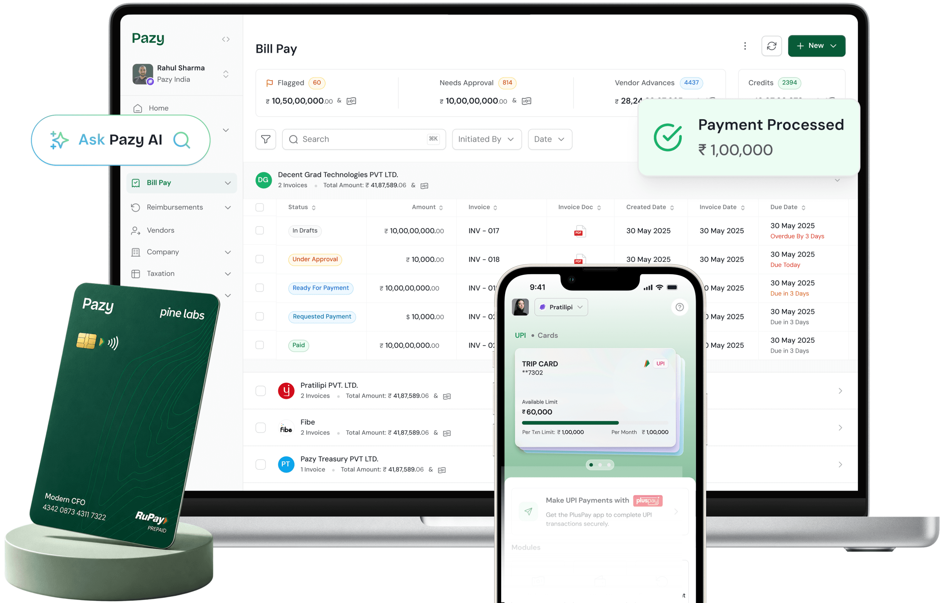
This case study covers my work as founding product designer at Pazy, a business payments platform in Bengaluru. It details how a UX audit and a two-day discovery workshop turned a broad founder vision into ₹566M+ processed in year one.
Note: the platform was called Continuo when I joined, and the rebrand to Pazy came out of the same engagement, so both names appear here. Client names appear only where the outcome is already public.
After four years designing across logistics, edtech and construction tech, I took the founding design seat at a fintech, in a domain where being wrong is not a usability problem but a compliance failure.
The mandate had three parts, in order. Audit the product that already existed. Run discovery until the founders and I could describe the same product in the same words. Then redesign and rebrand it while shipping two new modules, Payments and Taxation, on a fixed calendar.
What made it unusual was the founders. Pratik and Devyanshu had spent years inside finance operations and had already drawn the product themselves. I was not filling a blank canvas. I was arguing with a good one.
Outcomes
Two problems arrived at once: a market that had never been served properly, and a product of our own that was not yet serving it.
My first week, I asked a finance manager at a mid-sized manufacturer to walk me through his monthly vendor payment run. He opened fifteen browser tabs. Bank portals, spreadsheets, email threads, WhatsApp conversations, all to pay 500+ vendors once.
Twenty-five more interviews across manufacturing, BFSI, retail and media said the same thing three ways:
In parallel I audited what was already live. The domain logic was right. The interface was not carrying it, and the failures were specific enough to become a backlog on their own:
We mapped sixteen players, from Zoho Books and RazorpayX to Volopay, EnKash and Cashflo. Every one of them was a point solution. Nobody was solving payments and taxation together for a cost-sensitive Indian SME.
Competitors charged per seat, so teams bought the minimum. Which meant the person who had to approve an invoice often had no login. The workflow did not break for technical reasons. It broke commercially.
"Unify every business transaction" is a vision, not a backlog. I facilitated a two-day workshop to turn one into the other, with both founders in the room for all of it.
"To collect knowledge, generate new ideas, and ideate on design solutions, it's best to bring people together."
The premise the workshop opened on
Vision and project goal, success mantras, value proposition and competitors, user groups and behaviour, empathy mapping, business model canvas, tech constraints, and an honest look at the current product.
The vision, written downWe did not leave the first session until everyone signed the same sentence: give founders and business owners a platform to stay financially complete, compliant and in control, always in real time.
Then the founders' reasoning went on the wall, because a scope decision is only defensible if you can trace it to a belief. Pratik's was blunt: the finance tech stack is limited and outdated, every business owner has to be a capital allocator and has no tool for it, and accounting-first software will not be the tool of choice in ten years.
The timing argumentIndian GST compliance had just moved from summary level to invoice level, on a fixed monthly calendar. That single regulatory change is what made an invoice hub inevitable rather than merely nice, and it is what settled sequencing: payments first.
This session changed my model most. I had been treating the finance manager as the user. The workshop established a hierarchy instead: finance controllers, finance operations and CAs are primary and ideal. Founders, VP Finance and ordinary employees are secondary, but they are the ones who unblock the work.
Which produced the market gap in four lines. SMEs are cost sensitive with small teams and cannot run multiple tools. Accounting arrives last, so cash visibility is never real time. Processes sit with different teams and nothing bridges them. And seats-based pricing hides the data from exactly the people who need it.
That last point became a product principle: no seats-based user management. Every relevant stakeholder sees what is relevant to them. It is a commercial decision that only makes sense after you have watched an approval chain break.
Running says, thinks, does and feels separately for each group is what stopped us building one average product for nobody.
Worried. Are we closing on time, are we compliant, where is the money going. Finance is complex, literacy is uneven, and they cannot find the right number at the moment they need it. Most treat compliance as a supporting function until it bites.
Tired. Task repetition, endless chasing, no product bridging them to clients. Their questions are commercial: is my time reducing, can I differentiate my servicing, is this worth it.
Frustrated. Data silos above all, scattered across platforms, plus books closing, compliance, reconciliation, and the overhead of keeping everyone updated.
Read together, the three maps say the same thing from three angles. The work is not hard. The coordination is. That reframed the product from an automation tool into a bridge, and "we can be the bridge between CAs and business owners" became the strongest opportunity on the board.
Day two mapped one job end to end, invoice management, across all six phases: awareness, research, decision, onboarding, service and support. Onboarding is where the map earned its keep.
We established that 90% of the data we need already sits in Tally or Zoho: expense heads, vendors, employees. Zoho could be a one-click sync. Tally, then, meant the client sending data and our team loading it. GSTs, expense heads, vendors and employees all had to land at onboarding or nothing downstream worked.
The emotional arc was legible too: excitement, then fear and uncertainty about new workflows, then a sense of control, but only once a first invoice completed a full round trip through approval to payment.
So the onboarding target stopped being "a beautiful setup flow" and became get one invoice all the way through, fast. Due date captured at upload, because payments depend on it. Approval chain declared up front, because that is what was breaking. Expense-head tagging last, right before books close.
Then personas, the feature list, and the part that mattered most: every feature plotted on impact against business effort.
Payments, the invoice hub, approval management and vendor management went into "now". Credit and treasury were named, agreed and explicitly deferred. That is the only reason payments went live on schedule, and the deferral was as much a deliverable as anything we drew.
Everything below was agreed in the room. None of it needed relitigating for the next twelve months.
Complete, compliant, in control, always in real time. One sentence, signed by everyone.
Controllers, finance ops and CAs primary. Founders and employees as unblockers, not as the target.
Automation-first, banking-agnostic, compliance-native. The workshop compressed into three words I could hold during a scope argument.
Payments, then invoice hub, then reimbursements. Accounts receivable and treasury as the long game.
Trust, simple, well structured, automation, business finance. These became the design system's brief.
Finance ops treat us as their source of truth. CAs manage more clients with less manual work. Employees can see what happened to their invoice.
The founders' concepts were domain-perfect and user-hostile. Almost nothing needed removing. Almost everything needed reordering.
The concepts were drawn the way a finance expert thinks, not the way a finance user works. Everything appeared on every screen, because to the person who drew it, everything mattered.
The audit had already priced that: density without hierarchy, and users who could not tell what the system had done for them.
Keep the domain logic exactly. Change only the order in which it reaches the user. Progressive disclosure as the governing rule, and system state made visible at every step.
Then review every redraw with the founder who drew the original, before building it.
Onboarding friction and support tickets both halved in the first month after launch.
And no compliance regression, which is the trade that would have got us rejected in procurement review.
In a product where a misread figure is a filing error, the interface details are not polish. They are the feature.
Fixed-width digits everywhere amounts appear, so columns align and two invoices can be compared by eye without reading either.
Amounts right-aligned for comparison down a column, labels left-aligned for reading across a row.
A single unambiguous format across the product. GST filing runs on a fixed calendar, so a misread date is a missed deadline.
TDS rate, expense head and approval chain inherited from the vendor, overridable per invoice. The repetition disappears without the control going with it.
Automatically fetched values labelled as fetched. Every action confirmed. Invoice status visible to the person who uploaded it, not just to admins.
Invoices sortable and filterable by due date, because that is the view an AP team actually works from.
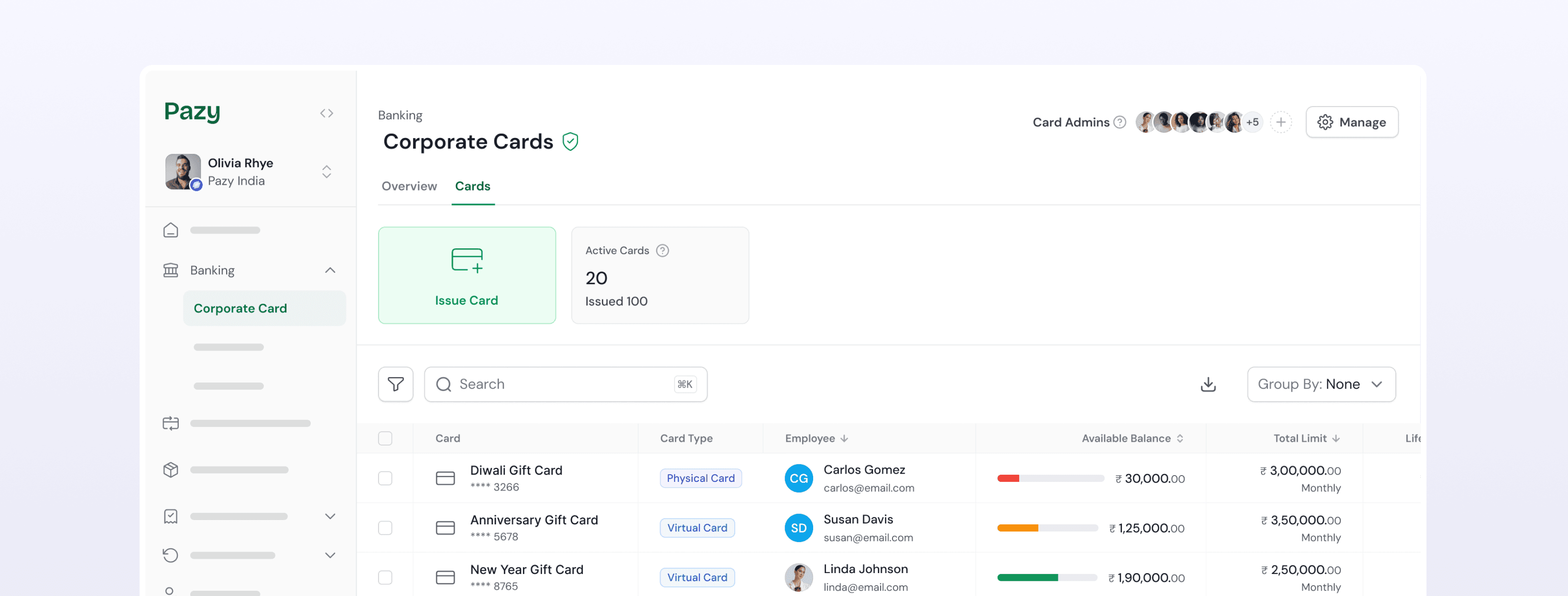
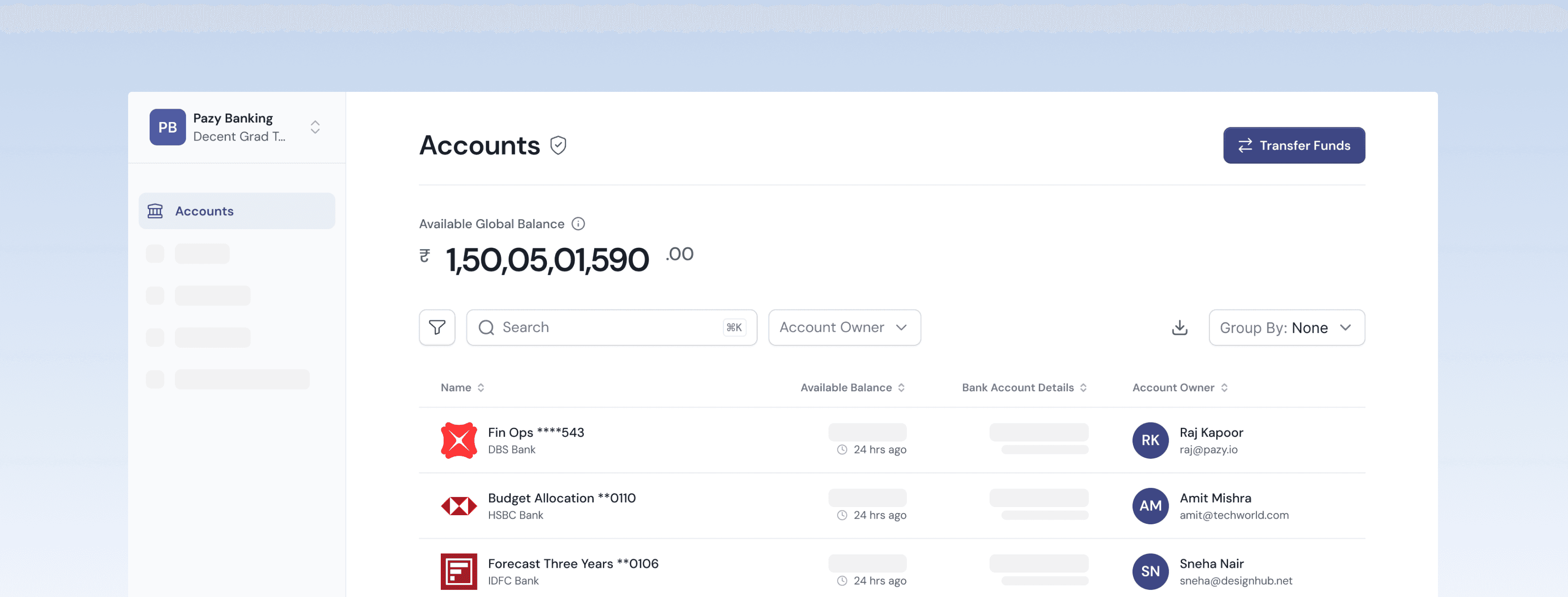
Everything the workshop put in the "now" column, live in production.
Invoices arrive via Slack, email or WhatsApp and are captured, extracted, matched and queued automatically. GST and TDS compute inline, with TDS inherited from the vendor.
Approvals as routing with visible state, so nobody has to go and read a status field to know where an invoice stands.
Pay directly from Pazy, single, bulk or partial, across every major Indian bank. The module the workshop put first, live on that schedule.
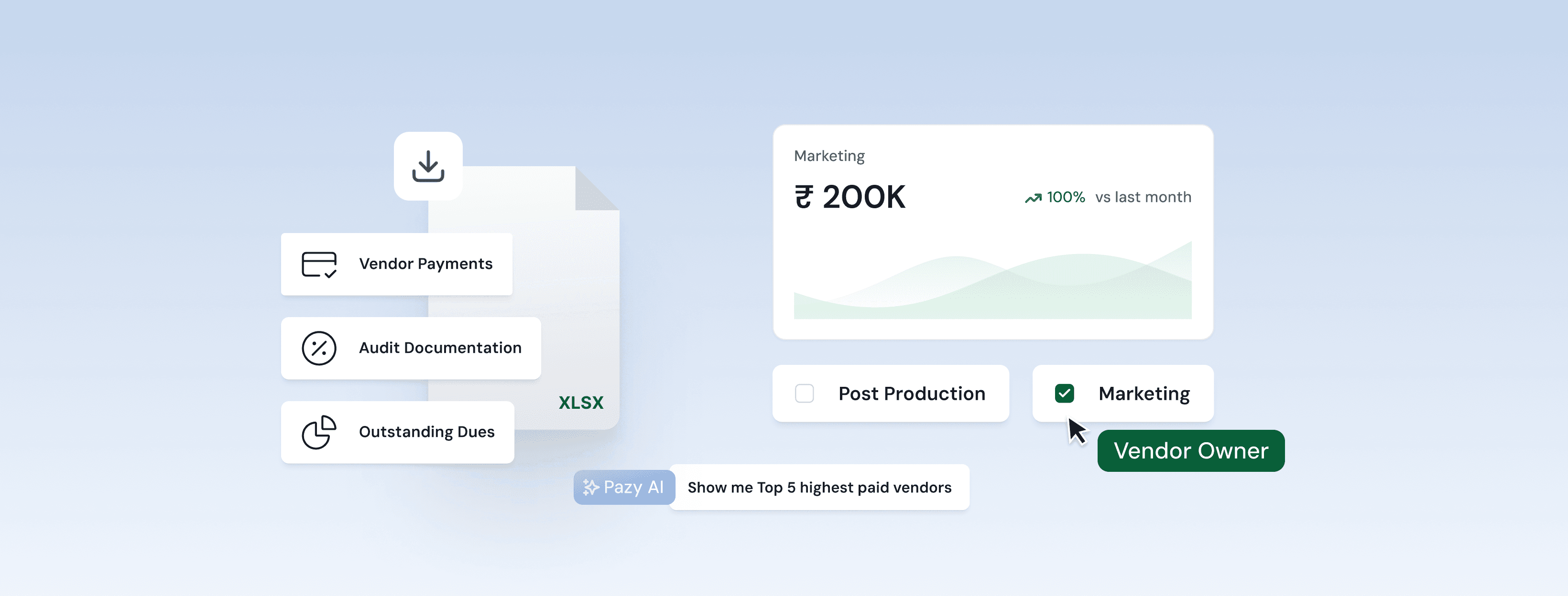
A command centre for 63,000+ vendor relationships, with KYC state on the record because it decides whether a payment can legally go out. Alongside it, live spend visibility that replaced the month-end spreadsheet reconstruction.
Twelve months after the workshop wall, measured against the definition of success we wrote on it.
Treat the platform as their source of truth for invoices, payments and vendors, and prefer it to the accounting tool they came from. That was the workshop's own test, and it passed.
Manage more clients with less manual work. The bridge we identified as the strongest opportunity is the thing they now use it for.
Submit an invoice and can see what happened to it. A small thing that removed most of the follow-up traffic the CAs were drowning in.
"You gave me my weekends back. Our finance team can finally focus on strategy instead of chasing payment statuses across five different portals every week."
Finance Manager · Enterprise manufacturing client
"The real-time data integration reduced invoice processing errors by 30%, significantly enhancing our decision-making capabilities."
CFO · MDP Coffee House · Verified Pazy client
The platform raised ₹6 crore in pre-seed funding from Inuka Capital and Gemba Capital in June 2025, and is now targeting ₹10,000 crore in annual spend under management. The long game is the one named on the workshop wall and deliberately deferred: accounts receivable, then treasury.
Two years in the founding seat, in a domain I had never touched. Here is what held up and what I would do differently.
I'd happily walk you through the detail: the research, the hard calls, the features we shipped and the ones we killed, and what building Pazy taught me about designing for real users with real money on the line.
Designing admissions lead management for counsellors working across the UAE, India and the UK, in one system instead of five.
Global Schools Group runs campuses across several countries, and every one of them ran its own admissions funnel. The brief was a CRM. The problem turned out to be narrower, and more useful.
Enquiries arrive from web forms, walk-ins, phone calls, events and agents, then live in whatever tool the local team happens to trust. Leads go cold in a spreadsheet nobody owns.
Counsellors did not lack data. They lacked a defensible answer to that one question at the start of every working day. Everything I designed had to answer it.
Interviews with counsellors and admissions leads, mapping how the work actually flowed rather than how the process document said it did.
With no scoring, counsellors triaged by whichever parent chased hardest, not by likelihood to enrol. The loudest family won the attention regardless of fit.
The same details were captured again at each stage, in a slightly different place, by a different person. So no single record was trusted.
Regional heads could not compare funnel health across countries without someone manually assembling a report first.
Priority lived in each counsellor's head, rebuilt every morning from memory and whoever had called most recently.
Put the priority in the list itself, so the queue carries the decision rather than the person. Then make the reasoning inspectable.
A 40% cut in manual work, most of it from the qualification flow rather than from the scoring model.
Each one aimed at a single research finding, so the link between what we heard and what we built stayed traceable.
The model surfaced directly in the counsellor's list, so the ordering itself carried the priority. No separate dashboard to consult.
The interface had to make the score legible, showing why a lead ranked high. A score users cannot interrogate is a score they quietly work around.
Qualification became a single flow where each stage asked only for what it needed and carried everything forward. This is where most of the 40% came from.
Stage definitions held constant across regions while the numbers underneath stayed local, so a funnel in Dubai could be read against one in Bengaluru.
Happy to walk through the research, the scoring model and the trade-offs behind the qualification flow.
Real-time quantity takeoff for architects and contractors, translating a building model into cost estimates a field team can act on.
A BIM model already contains every quantity an estimator needs. The difficulty is that it contains everything else too.
The model is complete. Exhaustively so. Getting from it to a takeoff meant exporting, cross-referencing schedules and rebuilding numbers by hand in a spreadsheet.
Hours of work per revision, and a fresh opportunity for error each time the design changed. What a quantity surveyor needs is a figure they can commit to.
This was a 0→1 product. There was no legacy interface to defend, which sounds freeing and isn't: with no existing behaviour to observe, every assumption about how estimators think had to be checked before it hardened into architecture.
The temptation with dense data is to expose it faithfully. That produces a model browser, not a takeoff tool.
Anchor on a different question: what does a quantity surveyor need to see in order to commit to a number? Then show only that, with everything else one step away.
Takeoff time collapsed from hours to minutes, and estimators changed how they used the tool entirely.
Written down early, and used to settle every layout argument that followed.
The measurable output leads. The model is how you verify a number, not how you navigate to it.
Every figure stays linked to the elements it came from, because an estimate nobody can audit is an estimate nobody will sign.
Recalculation on change is what collapses hours into minutes, so the interface had to survive constant revision without losing the user's place.
These people are not always at a desk with two monitors. Layouts had to stay legible under site conditions.
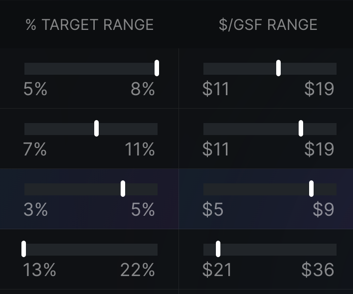
Rules are cheap until they meet a real estimate. Three parts of the shipped product carry most of the weight, and all three exist to answer the same question: how much should I trust this figure?
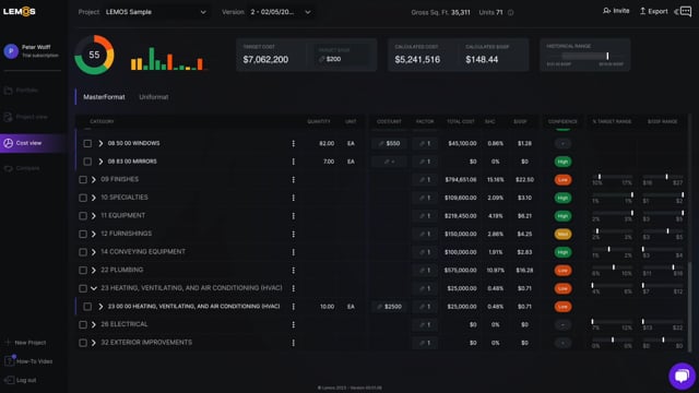
Quantities reach the platform through a Revit add-in and land in whichever classification the estimator already thinks in — MasterFormat, Uniformat or the raw Revit categories — switchable without losing your place in the list.
Each time the architect republishes, the model arrives as a new version rather than an overwrite. That is the whole traceability rule made concrete: a change is something you compare against the last one, not something you discover when the total moves.
The interesting result wasn't speed for its own sake. When a takeoff takes minutes, estimators stop treating it as a one-shot deliverable and start using it to compare options.
That is a different, and better, use of their expertise, and it was not something we designed for directly. It fell out of making the thing fast.
In data-dense domains the design work is subtraction. Deciding what not to show is what makes the tool usable.
On a 0→1 product with no incumbent behaviour to study, that decision has to be re-tested constantly, because the first plausible answer hardens into architecture faster than it deserves to.
I can walk through the information architecture, the traceability model and what we learned from field teams.
LEMOS wound down in 2025 — lemos.ai and the app at app.lemosqto.com are both offline, so there is no live product to link to. Happy to walk through the work directly.
A unified platform connecting shippers, carriers and brokers: load booking, fleet tracking and freight billing in a single interface.
Freight is a coordination problem wearing a software problem's clothes. The same shipment means something different to each party handling it.
Wants the load moved, on time, at a price agreed in advance. Cares about exceptions, not about fleet utilisation.
Wants trucks full and invoices that clear without dispute. Cares about scheduling, not about the shipper's inventory position.
Sits in the middle across four systems: one for booking, one for tracking, one for billing, and email for everything the others cannot handle.
The design challenge was not the individual screens. It was that a single interface had to be honest to all three roles without becoming a compromise that served none of them.
Three roles, four tools, and no shared record. Every disagreement became an argument between two versions of a spreadsheet.
Treat the shipment as the shared object and the role as the lens on it. Same underlying record, different defaults, different actions, different sense of what "urgent" means.
Four separate tools replaced by one platform, with disputes resolved against shared history instead of parallel records.
Designed around matching and confirmation speed, since hesitation is what loses capacity.
Built for exceptions rather than status. Nobody needs to watch a shipment that is on time.
Tied back to the same record, so disputes are resolved against shared history instead of two spreadsheets.
Brokers move between perspectives without switching context or losing state, because that switch is their whole job.
Finding the single object everyone agreed on. Once the shipment was the shared record, the roles were free to disagree about everything else without fragmenting the product.
Designing tracking around exceptions rather than status also removed most of the noise, because the default state of a shipment is "fine".
Multi-stakeholder products fail when you design three products and ship them in one shell.
The leverage is in finding the one thing all parties agree on, then letting the roles diverge on top of it. Consolidation is a design outcome, not a technical one.
I can go deeper on the role model, the exception-first tracking design and how billing disputes shaped the data structure.
Redesigning a Catholic OTT app across SmartTV, iOS and Android, where the remote control, not the thumb, is the primary input.
Shalom World had the content and the audience. What it lacked was a structure a viewer could navigate from the sofa, with a directional remote and no keyboard.
A pointer reaches anything in one movement. Search is a keystroke. Hierarchy costs almost nothing, so catalogues can be deep and browsing is a reasonable default.
Every extra level is a sequence of button presses. Search is a chore performed one letter at a time. The habits web design rewards are the ones television punishes.
And the same content library had to make sense on a 55-inch screen across a room and on a phone held on a commute, without becoming two different products.
Most of this project was information architecture rather than visual design.
The first screen deferred the decision to the viewer, which on a remote is the most expensive thing you can ask.
Restructure how content is grouped and surfaced so the first screen carries real editorial intent, and the likely next action is always one press away.
Session time up across all three platforms, with the same structure holding on TV and mobile.
Rows organised around why someone opens the app, not how the library happens to be filed.
Fewer levels to traverse, with the most likely next action always one press away.
Participation surfaced where viewers already are, rather than parked in a separate destination nobody navigates to.
Consistent structure across SmartTV, iOS and Android, with input patterns respected per device.
Treating the remote as the design constraint rather than an inconvenience. Once every decision was priced in button presses, the hierarchy argued itself.
On TV the design question is never "where do we put this?" It is "how many presses does this cost?"
Constraining the input clarified the hierarchy faster than any amount of visual iteration would have.
Happy to walk through the IA work, the remote-navigation model and how it translated to mobile.
Where I've built, what each domain taught me, and the three rules I keep coming back to.
I'm a product designer based in Bengaluru with 4.5 years spent building products that make complex workflows feel effortless. I turn messy, research-heavy problems into interfaces that drive real outcomes, and I'm most useful when the problem is genuinely tangled.
My approach starts with deep user empathy. You can't design the right solution until you understand the problem, not from a brief, but from the people living inside it. That conviction guided my work at Pazy, and it's what I carry into every engagement. Before fintech I designed across logistics, construction tech, OTT and edtech at Lollypop, each domain teaching me how differently industries think about experience.
I believe the best designs aren't the most beautiful ones. They're the ones that solve a real, daily frustration for a real person.
I'm a full-cycle product designer, equally comfortable in user research, information architecture, interaction design, and building production-ready design systems. At Pazy I was the only designer: researcher, strategist and executor simultaneously.
My fintech background means I understand compliance, audit trails, GST, TDS and AP workflows at a depth most designers skip, which changes how I frame problems, write user stories, and make trade-off calls with engineering.
Structured interviews, contextual inquiry and usability testing, translating behaviour into product decisions that stick.
Token-based and component-driven, built to scale. Systems that let engineers ship confidently without pinging design every sprint.
Blank canvas to live product, multiple times. IA, MVP strategy and product vision alongside founders.
High-fidelity interactive builds in Framer and Webflow that bridge design and engineering.
The most expensive design mistake is solving the wrong problem beautifully. I don't open Figma until I've spoken to the people who will actually use the product, because what users say they want and what they actually need are almost never the same thing.
Complexity is easy; clarity is the hard part. B2B tools earn trust by surfacing only what's relevant at each step, not by impressing users with everything they could do. If a feature needs a tooltip to explain it, the design isn't finished.
Real users work inside compliance requirements, legacy integrations and organisational politics. The designer who understands those constraints (GST, audit trails, multi-approval flows) ships products that survive procurement review. The one who ignores them doesn't.
Open to product design roles, collaborations, and conversations about craft. Based in Bengaluru, available globally.